Emdashes—Modern Times Between the Lines
The Basics:
About Emdashes | Email us
Ask the Librarians
Best of Emdashes: Hit Parade
A Web Comic: The Wavy Rule
Features & Columns:
Headline Shooter
On the Spot
Looked Into
Sempé Fi: Cover Art


Mad Men, Season 4: The Futility of Resisting Bodily "Sin"
Filed under: The Squib Report Tagged: Doris Day, George Orwell, Mad Men, Martin Schneider, Matthew Weiner, Woodstock

Martin Schneider writes:
It's interesting how positive a reaction the Honda shenanigans got from all the pro bloggers documenting every detail of the Draper Saga. During one commercial break while watching the most recent episode, "The Chrysanthemum and the Sword," I commented to my co-watchers, "What is this, Three's Company?" It reminded me of the Ham Scam from s04e01, after which Don scolded Peggy, but good. Nobody I read pointed out the parallel. The Honda sequence was as rich and enjoyable as everything that happens in Mad Men, but I didn't enjoy it more than anything else on the show.
I was more taken by the plight of Sally Draper, whose predicament is getting more gut-wrenchingly alarming by the scene. I think what skewers our hearts so damnably about Sally is that nothing is really under her control. Her supposedly "rebellious" act of cutting her own hair seemed just beyond (continued)

Daily Comic: Coywolves
Filed under: The Wavy Rule Tagged: cartoons, comics, coywolf, coywolves, Pollux

Daily Comic: NetPuppets
Filed under: The Wavy Rule Tagged: cartoons, comics, Netflix, Pollux, puppet, puppets

Daily Comic: The Semicolon versus Lady Asterism: II
Filed under: The Wavy Rule Tagged: asterism, comics, Lady Asterism, Pollux, superhero, superheroes, The Semicolon

When last we saw The Semicolon, he had been shackled and blinded by Lady Asterism. We continue his adventures…
(continued)
Daily Comic: Katie and Her 7 Evil Exes
Filed under: The Wavy Rule Tagged: comics, love, Pollux, romance, Scott Pilgrim

Daily Comic: Typeface Beauty Pageants
Filed under: The Wavy Rule Tagged: beauty pageant, cartoons, comics, parenting, Pollux, typeface, typography

For When You're Looking for Emily Fox Gordon But Find Emily Gordon Instead
Filed under: Little Words Tagged: Emily Fox Gordon, Emily Gordon, Emily Gordons
The world of Emily Gordons is an honorable guild of creative workers, with only a few exceptions—and those exceptions get a free pass because they’re undergraduates and, lord knows, we would have made awful fools of ourselves if we had been online then. (By “we,” I mean “me.”) Notable Emily Gordons include the polymathically brilliant Emily Gordon, writer of Gynomite! and, among many other things, a licensed therapist who gives me platinum advice for free. And for more than a decade, I’ve been following the writing career of Emily Fox Gordon, whose beautifully crafted essays, fiction, and book-length nonfiction are a pleasure to read. Now she’s working on a new novel, and, speaking for all Emily Gordons, we are very excited to read it. —Emily Gordon (continued)
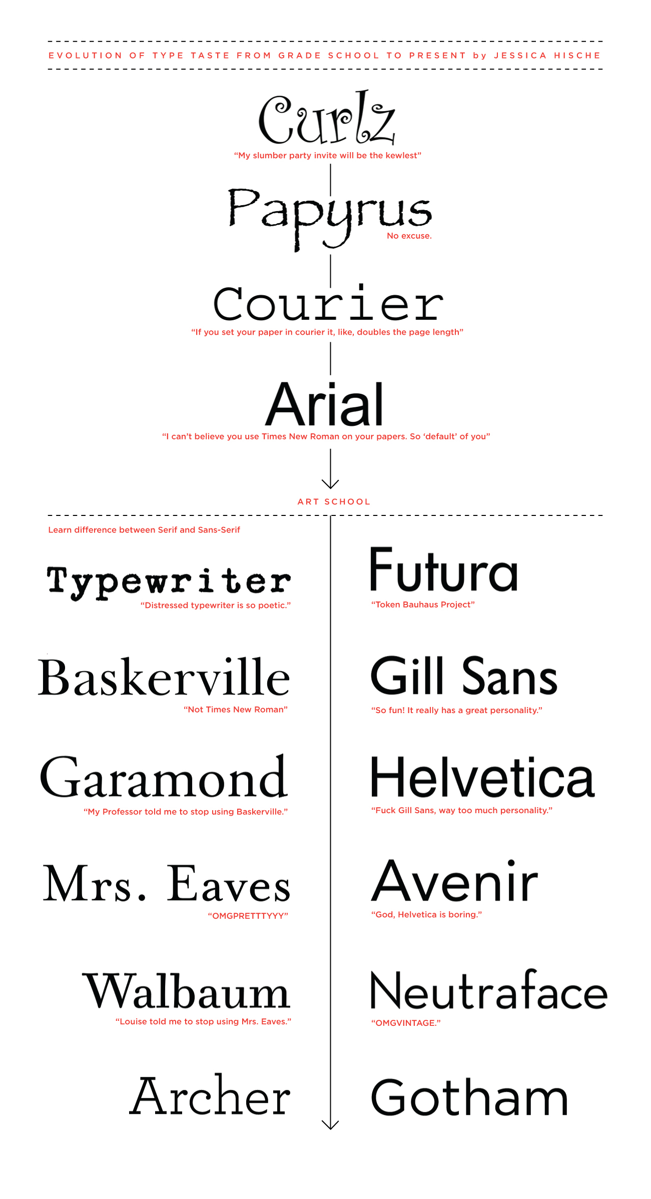
Even When It's Bold Italic: Typefaces to Love and Serenade
Filed under: Looked Into Tagged: American Theater Company, Cab Calloway, Caleb Crain, cartoons, David Mamet, DD40, design, DesignScout, Elmer Simms Campbell, fonts, Jason Kinney, Jessica Hische, Jonathan Lethem, Lady Gaga, maps, Mark Searcy, music, Neutra Face, Nicholson Baker, plays, Richard Posner, Speed-the-Plow, theater, typography, Wired, YouTube
“Obsessing about fonts is a form of procrastination, so of course I have indulged in it ever since I graduated from a TRS-80 Model III to a Macintosh.” —Caleb Crain
“The main thing, though, is to use some nonproportional typewriter-style font—you need the sentences to look their worst until the dress rehearsal of the galleys, when all the serifs come out dancing.”
—Nicholson Baker
Emily Gordon writes:
My Chicago actor pal, taking a break from rehearsing Speed-the-Plow, just pointed out this 2007 gem from Slate: “My Favorite Font: Anne Fadiman, Jonathan Lethem, Richard Posner, and others reveal what font they compose in and why.” I wonder if they’ve all changed their minds by now? Caleb, how about you?
That thought sent me searching for this hilarious Jessica Hische post from earlier this year, a mini-autobiography of a typophile called “My Evolution of Type Taste from Grade School to Present”—click to enlarge and read her arch asides on questionable font attractions. Meanwhile, ambling along the googleway, I landed on this post about various other designers’ favorite faces. (continued)
Daily Comic: Forgotten Greek Myths
Filed under: The Wavy Rule Tagged: comics, hand-dryer, mythology, Pollux
¡Time's Up! Put Down Your Pencils; Punctuation Will Now Answer Your Letters.
Filed under: Headline Shooter Tagged: Ben Greenman, books, contests, fiction, letters, punctuation, What He's Poised to Do

That’s our fervent hope, anyway. In the meantime, we’re sifting the nearly 150 entries into our write a letter to a punctuation mark contest. Mail call brought gladness to the ampersand, the grawlix, the Oxford comma, the underline, and everything (everyone? the marks have all been so brilliantly personified that we can no longer think of them as mere shapes on a page) in between. We’ll pick five top finalists this week and list them here, and we’ll want to hear what you think about it. Got a favorite entry? Have a beef to hoist? Tell us here!
As you know, the final finalist will get a signed and hand-punctuated copy of Ben Greenman’s new collection of stories, What He’s Poised to Do. Mr. Greenman will choose the top letter himself. May the best mark win! —Emily Gordon (continued)