Emdashes—Modern Times Between the Lines
The Basics:
About Emdashes | Email us
Ask the Librarians
Best of Emdashes: Hit Parade
A Web Comic: The Wavy Rule
Features & Columns:
Headline Shooter
On the Spot
Looked Into
Sempé Fi: Cover Art


Even When It's Bold Italic: Typefaces to Love and Serenade
Filed under: Looked Into Tagged: American Theater Company, Cab Calloway, Caleb Crain, cartoons, David Mamet, DD40, design, DesignScout, Elmer Simms Campbell, fonts, Jason Kinney, Jessica Hische, Jonathan Lethem, Lady Gaga, maps, Mark Searcy, music, Neutra Face, Nicholson Baker, plays, Richard Posner, Speed-the-Plow, theater, typography, Wired, YouTube
“Obsessing about fonts is a form of procrastination, so of course I have indulged in it ever since I graduated from a TRS-80 Model III to a Macintosh.” —Caleb Crain
“The main thing, though, is to use some nonproportional typewriter-style font—you need the sentences to look their worst until the dress rehearsal of the galleys, when all the serifs come out dancing.”
—Nicholson Baker
Emily Gordon writes:
My Chicago actor pal, taking a break from rehearsing Speed-the-Plow, just pointed out this 2007 gem from Slate: “My Favorite Font: Anne Fadiman, Jonathan Lethem, Richard Posner, and others reveal what font they compose in and why.” I wonder if they’ve all changed their minds by now? Caleb, how about you?
That thought sent me searching for this hilarious Jessica Hische post from earlier this year, a mini-autobiography of a typophile called “My Evolution of Type Taste from Grade School to Present”—click to enlarge and read her arch asides on questionable font attractions. Meanwhile, ambling along the googleway, I landed on this post about various other designers’ favorite faces.
All this brought me, musically and giddily, back to the song that is in my head 1) every time I see my sunscreen, which is called Sport Face, and 2) every time I hear Lady Gaga’s “Poker Face.” Yes, it’s DD40’s (Jason Kinney and Mark Searcy) Gaga-meets-typographer beards spectacular, “Neutra Face.” Here’s what Michael Conroy at the Wired U.K. blog wrote about it: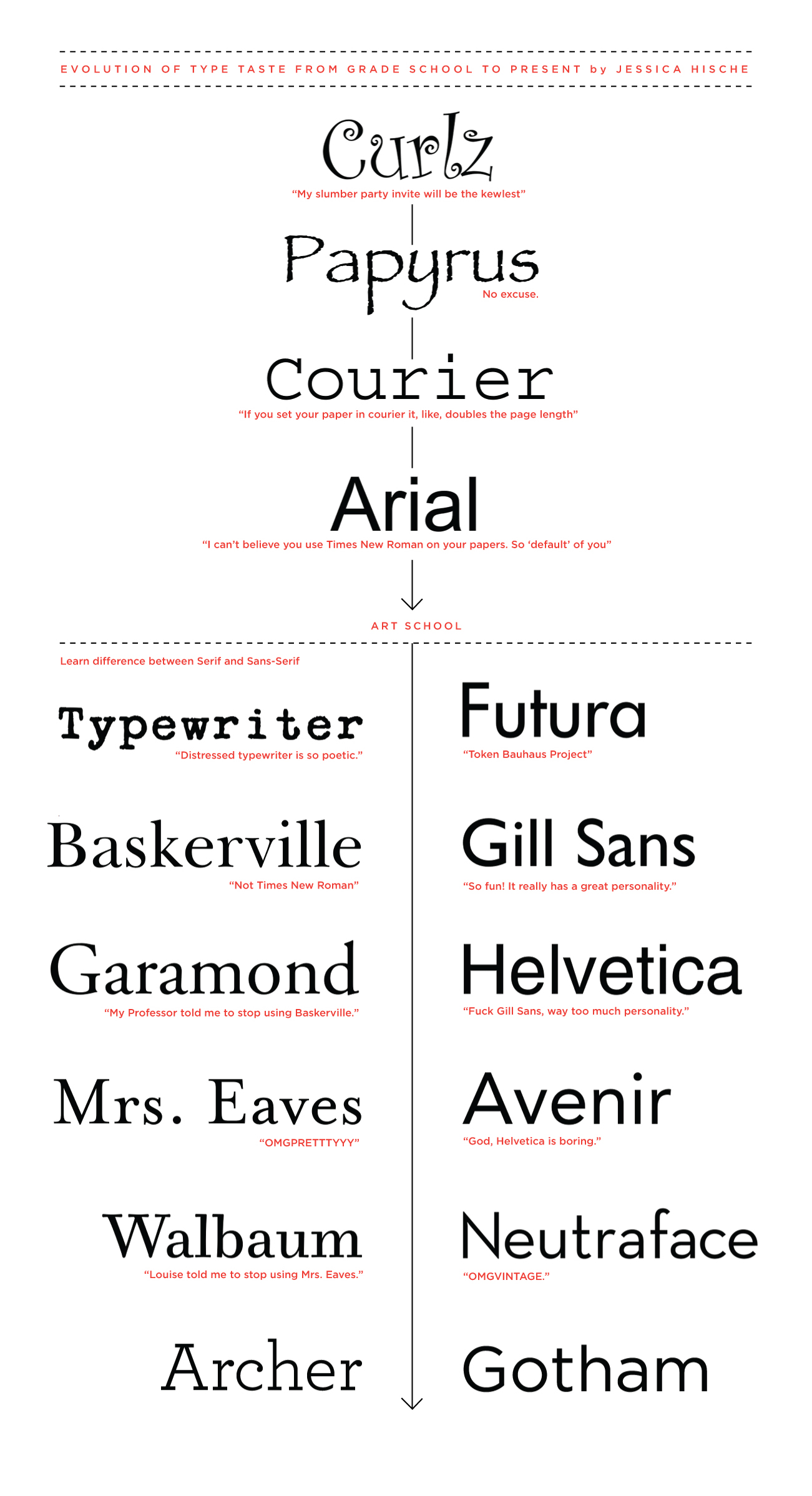
I’ve seen this video several dozen times since it first rocked the world of fonty montys everywhere, and I still think it’s incredibly funny. And (as the YouTube commenters well know) damn sexy, too!In a video that smacks of “it’s Friday afternoon, why not?” four guys have remixed Lady GaGa’s Poker Face into an homage to Neutraface, the light and airy modern font that I’m sure you’re all very familiar with…or perhaps not.
Either way, the sight of four hirsute men reimagining the Poker Face clip to perfection (“You’ll read my, you can read my Neutraface…even if it’s bold italic”) is sure to make you smile, not least their brilliantly choreographed moves portraying “bold” and “italic”, which should be licensed for use on dance floors everywhere.
Check out this and other songs DD40 have released - on cassette tape, no less - at their website.
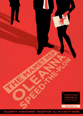
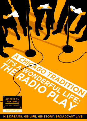
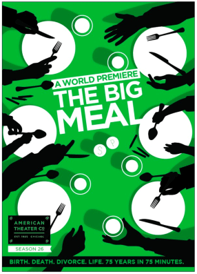
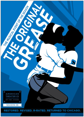
Speaking of design and Art, and Speed-the-Plow, aren’t these handsome posters for the American Theater Company’s new season? (Click on “the plays.”) If anyone knows who the designer is, let me know. (Update: DesignScout. Thanks Lance!) I will not be missing this (R-rated! sassy!) production of Grease.
Finally, check out this fantastic 1932 map of Harlem nightclubs, drawn by the cartoonist Elmer Simms Campbell. I love this for many reasons, including the appropriately prime spots for Cab Calloway and the Savoy Ballroom, and the hand-lettering is just so. Happy procrastinating!
Comments
They are swell, aren’t they? Would have preferred an above-the-title billing, but that’s just me being Method. Design by designscout.tv.