Emdashes—Modern Times Between the Lines
The Basics:
About Emdashes | Email us
Ask the Librarians
Best of Emdashes: Hit Parade
A Web Comic: The Wavy Rule
Features & Columns:
Headline Shooter
On the Spot
Looked Into
Sempé Fi: Cover Art
A Little More Background on Crumb's "Elvis Tilley"
Filed under: Eustace Google Tagged: art, Art Spiegelman, audio, cartoons, Chris Ware, contests, covers, Eustace Tilley, Francoise Mouly, interviews, Matt Dellinger, newyorker.com, podcasts, R. Crumb, Seth, Tina Brown

Martin Schneider writes:
The “New Yorker Out Loud” podcast featured an intriguing revelation this week, and I thought I’d draw a little more attention to it.
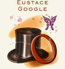
In recent weeks Emily has followed the Eustace Tilley contest with understandably keen interest. It’s worth recalling that this manner of remix or appropriation was once less customary—it was a mere 14 years ago that the iconic annual Eustace Tilley cover was “messed with” by the great R. Crumb. Since 1993 we’ve seen all kinds of versions by Art Spiegelman (1997), Chris Ware (2005), Seth (2008), and many others.
I wasn’t living in the United States at the time, so it was difficult for me to gauge the uproar, but I’ve heard that Crumb’s image of “Elvis Tilley,” whom The New York Times described as “a squinting, pointy-nosed street punk with a marked resemblance to his grandfather,” caused something of a stir.
Matt Dellinger interviewed Françoise Mouly this week for the podcast, and she divulged the back story to the cover:Dellinger: The first time you updated Eustace Tilley, it was for a portfolio inside the magazine. It wasn’t until your second year, in 1994, that you did it on the cover.Fascinating. I had always assumed that the cover was a sensation concocted by Mouly, her husband Art Spiegelman, and their boss Tina Brown, to goose the staider portions of the magazine’s subscriber base. How charming to learn that the whole thing was not a corporate provocation but an affectionate joke from the fertile mind of Crumb!
Mouly: It took a while before we could do it on the cover, because you may not judge a book by its cover, but you judge a magazine by its cover! … and it has to represent a kind of consensus. Ironically enough, that moment happened through somebody who had no other connection to the magazine, Robert Crumb, longtime friend…. and I’d asked him, as soon as I started here, to do a cover for The New Yorker, and he sent me this image, and it’s a young man looking at a flyer. And it just so happened to be on the sidewalk right in front of the building where our offices were at the time, on 42nd Street. So I recognized the sidewalk, and I was like, “Well why is he doing this young man with a flyer, okay….” I showed it to Tina, I was somewhat puzzled, and we accepted it as a cover to run, and it’s only like weeks after that I’m looking at it and I’m going, “Oh my god! Oh my god! It’s Eustace Tilley!” It just….
Dellinger: So neither of you saw it, neither of you understood….
Mouly: No, no! Because it’s actually very subtle, there’s no top hat, there is no butterfly….
Dellinger: Right, it’s a kid in a red baseball cap, on backwards, he’s looking actually not at a monocle but at a porn flyer.
Mouly: We have it up on our website, actually. Yeah, so, all there was of Eustace Tilley—he’s in a street, he’s not wearing a waistcoat, there’s no signifier, it’s a profile of somebody … the only thing is the looking down at what you’re looking at, the kind of supercilious look. That’s what Robert got and completely repackaged it. It was too beautiful to not do it, by the time we did it as the first “breaking” of the anniversary issue. I think everybody in the office, the other editors, had given up on any kind of decency on the cover anymore, so….


Comments
I can’t imagine an issue of the ‘New Yorker’ ever causing an uproar, but the Mouly and Spiegelman roster of illustrators is what got me paying attention to the magazine.