_Pollux writes_:
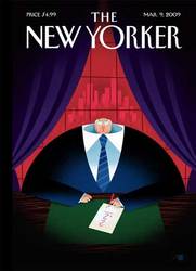
In a gloomy office, darkened by heavy, purple curtains, in a building that towers high above the city, a captain of industry scribbles a modest sum. He does so with a stubby pencil on a sheet of elementary school paper, the kind that always tore when you rubbed it vigorously with an eraser. The pencil is red, suggesting bankruptcy, insolvency, and failure. “I start by creating the most basic shapes and then refine with details as I go,” the cover artist, “Bob Staake”:http://www.bobstaake.com/enter, “has remarked”:http://drawn.ca/2008/10/06/bob-staake-creates-a-cover-for-the-new-yorker/ in regards to his methods, and a significant detail in his March 9, 2009 cover for _The New Yorker_, called “Downsized,” is in the math problem being worked on by the dome-shaped businessman. Two plus two always equals four, but the executive maneuvers his pencil in a downward swing that suggests that he is writing anything but the number four. He’s getting the simple math problem wrong.
Something else is of course wrong too. The senior executive’s head rests uncomfortably on a Brobdingnagian body. He is disproportionate, a brontosaurus, all body with a tiny head. But is he also all body and no brains? The incorrect answer to the simple math problem seems to suggest this. The executive’s body, long nourished by three-martini lunches, bottom-line brunches, and profitability picnics, now fills a room oppressive with defeatism and doom, its curtains suggesting the closing act of a once powerful business. Behind and below him, a once mighty city now exists entirely in the red.
Perhaps it was put there by the kind of executive that Staake depicts, who has been feeding on lucrative payouts and salary increases, and whose head rests on titanic shoulders like an olive on a Boehm porcelain plate. The bodies of these executives are draped in red, white, and blue power ties and Kiton suits fitted by master tailors from Naples, their fingers trembling in the presence of witless tycoons. Staake’s executive may be an idiot, but he’s not going anywhere.
Staake’s basic shapes work well here. His executive is entrenched, the sheer volume and solidity of his frame filling up an office that remains _his_ office. He’s settled, probably unaware of the chaos outside, an archetypical fat cat and plutocrat, who doesn’t need a top hat and cigar to look and appear rich.
Staake’s “past _New Yorker_ covers”:http://www.bobstaake.com/nyer/reflection.shtml, from his “Minimalist Christmas” to his beautiful “Reflection,” remain beguiling and expressive, as simple as their components may be. His illustration style, in part inspired by artists of the 1930s such as “Adolphe Mouron Cassandre”:http://en.wikipedia.org/wiki/Adolphe_Mouron_Cassandre, “Jean Carlu”:http://en.wikipedia.org/wiki/Jean_Carlu, and “Donald Brun”:http://www.idesirevintageposters.com/brun.html, evokes the earliest _New Yorker_ covers, harkening back to another economic depression that terminated an era of heady prosperity and optimism.
However, as much as Staake’s style may be rooted in the machine age aesthetic of 1930s Art Deco, his theme is all too modern. The economy is on everyone’s mind, whether that mind is large or small. Staake’s image of reduced power (economic power, brain power, and political power) speaks to a society, that, as of 2009, has come to realize that our captains of industry have failed us, and failed us badly.
Emdashes
Modern times between the lines