Emdashes—Modern Times Between the Lines
The Basics:
About Emdashes | Email us
Ask the Librarians
Best of Emdashes: Hit Parade
A Web Comic: The Wavy Rule
Features & Columns:
Headline Shooter
On the Spot
Looked Into
Sempé Fi: Cover Art


Sempé Fi (On Covers): Bridge to Nowhere
Filed under: Sempé Fi Tagged: Adrian Tomine, Andy Borowitz, art, Barry Blitt, Brooklyn Bridge, Bruce McCall, covers, Facebook, iPod, Pollux, René Magritte

Pollux writes:
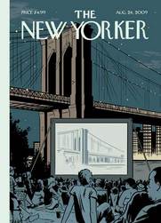
There is a feature playing in an outdoor theatre alongside the Brooklyn Bridge. Tickets are free. All are welcome to come. Flickering on the screen is a shot of the Brooklyn Bridge itself. The audience is entranced. It is a diverse crowd. No one looks at the actual bridge looming behind the improvised cinema.
A movie under the stars makes for a decent Saturday night, maybe a good “second date” or “third date” sort of outing.
Why look up at a marvel of engineering when you can see it on a much smaller screen? No craning of the neck is required; you can see it as you see most of the world: through streaming videos on the CNN website, through newly uploaded Snapfish albums, through the muted flash of Kindle screens.
For the August 24, 2009 cover of The New Yorker, Adrian Tomine makes a statement about our world. It is a world in which life and culture seem to be permanently plugged into any device that has a screen: films, iPods, television, and computers. We could spend our whole day viewing, viewing, and viewing some more, and this has become the stuff of life itself. It is life not led but LED, a light-emitting diode existence.
René Magritte created the same sort of imagery and made the same sort of comment in the two paintings called The Human Condition. These paintings depicted paintings: in them an easel stands before an open window. The painting on the easel depicts the very same landscape it is concealing. It depicts and conceals it at the same time. Magritte thus toys with reality and our conceptions of it. The painting on the easel is no more and no less real than the landscape behind it.
Tomine’s Magritte-like cover is appropriate to our times. His Brooklyn Bridge is not real; it is simply a depiction of it. Is it any less real than the film that portrays it? Is the film a documentary or a feature film starring the It Girl of the moment?
Our world is a world in which Facebook friendships seem more vigorous and more affectionate than the flesh-and-blood variety. As the ever-waggish Andy Borowitz once joked, he loves his Facebook friends because they would never betray him as his real friends would.
Are we becoming a world in which reality on the screen is becoming more real than flesh, blood, stone, and brick?
Will battles between nations become transformed into cyber-attacks, in which the websites of embassies are hacked and cities themselves are left untouched and un-bombed? No, that is wishful thinking. It seems that only the good things in life are being transferred to the world of small screens: friendship, architectural works, and concerts.
Tomine’s last cover for The New Yorker, for the January 31, 2009 issue, depicted a different night scene: an ice-cream salesman braving the cold to sell his product, in which light and warmth emanate from the truck that serves as a refuge from the screaming winds.
Tomine’s new cover is equally incongruous, but not obviously so. Tomine makes his point gently and subtly, much like Bruce McCall. Tomine and McCall are the diametric opposites of artists like Blitt, who make their point with hammer blows. The New Yorker needs both types of artists.
We don’t live in an entirely virtual world. The shock of reality always intrudes upon our iWorld of little screens and Next buttons. Perhaps that is just as well. We are alive; what we see on the screen is not.