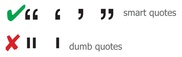
 There are smart cookies and dumb bunnies. (The latter term can apply to men and women alike, as far as I’m concerned.) There are smart moves and dumbfounding decisions. And, as every discerning typophile, copy cat, and design devotee knows, there are smart quotes and dumb quotes. The image to the right is a succinct visual summary. The Society of Publication Designers feels so (justly) strongly about it that they made smart versus dumb quotes lesson number one in their essential-vocabulary series.
Most recently, John Brownlee at Fast Company’s Co.Design defines the problem and provides the solution:
If you think about it, almost everyone is aware that quotation marks are not, in fact, vertical, but curled or diagonal. It’s how we write quotation marks on paper. So why do we type quotation marks on our keyboard this way?
Blame the advent of the typewriter. As [designer Jason] Santa Maria rightly points out, “Dumb quotes, or straight quotes, are a vestigial constraint from typewriters when using one key for two different marks helped save space on a keyboard. Unfortunately, many improper marks make their way onto websites because of dumb defaults in applications and CMSs.
The fix is blessedly simple. Refer to any of the links above, but especially bookmark Santa Maria’s firm and simple guide, Smart Quotes for Smart People. He knows what he’s talking about. Don’t be a dummkopf. Get smart!
Image credit: Radar Collective, “Cleaning up Bad Typography–10 Rules at a Time.”