Jonathan Taylor writes:
While we’re all talking about the Supreme Court: Anyone who has consulted an order or opinion on the Supreme Court’s site will know its attachment to the PDF, unsurprising given the format’s imperviousness to the vagaries of software. The staid, rather than stately, Century Schoolbook pages caged in one’s screen recall the defiance of David Souter amid the bells and whistles of Washington:
Turns out the court has some pretty stringent views on typography, and on the crafty task of assembling petitions, briefs and replies into little “booklets” for the justices to curl up with. From the Rules of the Court (PDF, natch, or HTML here):
Rule 33. Document Preparation: Booklet Format; 8½- by 11-Inch Paper Format
1. Booklet Format:
(a) Except for a document expressly permitted by these Rules to be submitted on 8½- by 11-inch paper, see, e. g., Rules 21, 22, and 39, every document filed with the Court shall be prepared using using a standard typesetting process (e. g., hot metal, photocomposition, or computer typesetting) to produce text printed in typographic (as opposed to typewriter) characters. The process used must produce a clear, black image on white paper. The text must be reproduced with a clarity that equals or exceeds the output of a laser printer.
(b) The text of every booklet-format document, including any appendix thereto, shall be typeset in Century family (e.g., Century Expanded, New Century Schoolbook, or Century Schoolbook) 12-point type with 2-point or more leading between lines. Quotations in excess of 50 words shall be indented. The typeface of footnotes shall be 10-point or larger with 2-point or more leading between lines. The text of the document must appear on both sides of the page.
(c) Every booklet-format document shall be produced on paper that is opaque, unglazed, 6 1/8 by 9 1/4 inches in size, and not less than 60 pounds in weight, and shall have margins of at least three fourths of an inch on all sides. The text field, including footnotes, should be approximately 4 1/8 by 7 1/8 inches. The document shall be bound firmly in at least two places along the left margin (saddle stitch or perfect binding preferred) so as to permit easy opening, and no part of the text should be obscured by the binding. Spiral, plastic, metal, and string bindings may not be used. Copies of patent documents, except opinions, may be duplicated in such size as is necessary in a separate appendix.
What’s more, there’s color-coded scheme for all those different types of supplications: your ordinary Petition for an Extraordinary Writ goes under a white cover, but a Brief for an Amicus Curiae in Support of the Defendant, Respondent, or Appellee, on the Merits or in an Original Action at the Exceptions Stage has got to be “dark green.” If you’re not sure what “light red” is, or you want to make sure your unglazed “tan” chapbook fairly screams “Brief Opposing a Motion to Dismiss or Affirm,” well, “The Clerk will furnish a color chart upon request”:
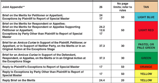
But note, it’s up to Counsel to “ensure that there is adequate contrast between the printing and the color of the cover.”
(In contrast, I’m a little surprised that, when it comes to adhering to word-count limits, “The person preparing the certificate may rely on the word count of the word-processing system used to prepare the document.” I wouldn’t want to test Clarence Thomas’s generosity with that rule.)
Via the promising site Typography for Lawyers, Ruth Anne Robbins, author of the manual (keep that Adobe Reader open) “Painting with Print,” suggests that the high court’s strictures might be necessary in light of lawyers’ slovenly word-processing habits. From the Journal of the Association of Legal Writing Directors, it’s a passionately footnoted plea for visually illiterate attorneys to wake up and smell the hot metal.