
Perhaps not, but it’s certainly worth a try. Click through to Boing Boing for details of the magazine’s new online competition, the results of which are sure to be a monocled, lepidopteran hoot.
The contest is being held on Flickr rather than newyorker.com; the image specs and rules appear there and also here. The group has 32 members so far, including me.
Over on Flog!, by the way, Fantagraphics maestro Eric Reynolds makes a sly reference in his report on the contest by heading his post “Johnny Ryan, are you reading?” I shall explain: Ryan, author of the singularly disgusting yet strangely mesmerizing Angry Youth Comix, included a nearsighted, um, awe-inducing character he called The New Yorker in a recent edition. I will append only three very tame panels from the storyline after the jump; pursue this further at your own risk.
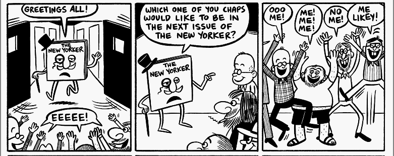
Click to enlarge; reprinted with permission. Caveat lector!