Profiles from Print magazine’s annual New Visual Artists issue (“20 Under 30”), 2007, 2008, and 2009:
Christian Cervantes:
It’s not every 29-year-old who inspires this kind of naked emotion in his boss: “I’m deeply, and unforgivably, envious.” That’s the chief creative officer of Ogilvy & Mather’s Brand Innovation Group, Brian Collins, talking about new kid Christian Cervantes. As his dramatic name suggests, the designer has an impossible dream: to reawaken brands as familiar to us as our own faces.
Take, for instance, Coke. Cervantes forged a radical new campaign for Coke Zero, which is marketed to young men. “The word ‘masculine’ brought up images of dudes bro-ing out over ‘chicks’ and football,” he groans. “I wanted to do something a lot more subtle but still powerful.” He commissioned the British studio iLovedust to help create an iconography of playfully masculine illustrations (“exploding fire hydrants, sensual lips, predatory animals and their prey . . .”), adding silhouettes of snowcaps and ice fishermen to provide the necessary chill. “I had so much fun creating these little worlds within worlds,” he says, and notes that the freedom the creative directors afforded him made all the difference. Continued.
Kate & Camilla:
Groucho Marx sang the praises of famous pairs: “Boy meets girl. Romeo and Juliet. Minneapolis and St. Paul.” Add to the list Kate and Camilla, a team of photographers who shared a camera one semester at Smith College and never put it (or each other) down. They do fashion shoots, but sometimes there are no people in them–just empty pants and boots, lounging in a field. They do portraits–of the manicurist Joe Shepard, forexample–but where his head should be, there’s the grave, iridescent-scaled face of a red snapper, held up like a commedia dell’arte mask. The people in Kate and Camilla’s work have texture, combination skin, complex lives, sweat, and occasional drips of fish blood.
Perhaps because of the photographers’ oft-stated willingness to photograph “anything” (which has come in handy for their Nerve.com blog), remarkable people tend to seek them out. One such figure is the singer Chan Marshall, known as Cat Power, whom they shot provocatively sporting a plastic tiger mask for Venus magazine. Kate says that part of what made the shoot so fun was that “the three of us–myself, Camilla, and Chan–were given free rein.” Matador spokesman Nils Bernstein knew they’d ace it: “I’ve seen them compared to Inez van Lamsweerde and Vinoodh Matadin, which I can see, but Kate and Camilla’s work doesn’t always have that icy perfection. They seem to love the tiny flaws and behavioral quirks that make people beautiful.” Along the same lines, Caroline Priebe, founder and designer of Uluru (a clothing line they’ve also shot for), calls their photos “striking, shiny, crisp, intimate, sexy, and almost edible.” Continued.
Eleanor Grosch:
So many animals end up in the Eleanor Grosch universe–on the pillows, rock posters, and Keds where her designs appear, for instance–that a Dr. Dolittle comparison wouldn’t be off base. In fact, she named her Philadelphia studio, Pushmepullyou, after the creature with a head at each end from the classic children’s book.
Such an animal also suggests Grosch’s harmonious opposites: commercial design with a strong commitment to the environment; freelance freedom and fiscal sense; pop culture and classical influences. Grosch walks a cheerfully nonchalant line between cute and cool, using a relatively limited palette and a menagerie of whimsical imagery. Creatures have always been an integral part of her life, beginning with her earliest memories of the Lowry Park Zoo in her hometown of Tampa. “I was absolutely in love with birds when I was small. Going to the aviary was like heaven for me!” she exclaims. “The roseate spoonbill, snowy egret, and grey heron were all pretty common sights.” Continued.
Zigmunds Lapsa:
Zigmunds Lapsa isn’t easily fazed. He grew up in Riga, the capital of Latvia, which he describes as a “country with 2.3 million people and 5.4 graphic designers at that time.” After two years in an unstimulating local design program, he decided that what he needed was more hands-on experience, a bit of which he’d gained through working for ad agencies to pay his expenses.
Hence, a leap: to London’s Central Saint Martins College of Art and Design, where Lapsa studied design and typography and found himself. He threw himself into real-world work with the British designer Bobby Gunthorpe, who praises Lapsa’s originality and says, “He would be embarrassed for me to say it, but he truly was an inspiration to his classmates.” Humble, hardworking, and handsome, too? “The fact he looks like a young Harrison Ford can’t hurt,” Gunthorpe says. Next, Lapsa returned to Riga to work for an interactive studio called Hungry Lab. The multiple logos and layered patterns he created for its identity mirror the studio’s penchant for surprise and experimentation. Continued.
Author Archives: Emdashes
I’ll Sing You Five-O, Green Grow the Rushes-O!
Five years ago today, I sat in the appropriately named Williamsburg bar The Lucky Cat (now Bruar Falls), enjoying tea and free wifi, and began this blog. One was far from a lonely number; from the beginning, Emdashes had friends, commenters (though as a readership, dear readership, you tend to be shy, preferring to send me thoughtfully composed emails rather than shout to the public square), supporters, and exactly one member of the peanut gallery, whose small legumes haven’t scarred.
But Emdashes today is a lot more than a gal in a bar feeling warm toward a heartbreakingly flawless Donald Antrim essay. It’s an honest-to-Irvin team, a clan of kindred spirits, a gathering place for like-minded New Yorker-philes for whom a casual read and a quick look will never be enough. It’s the blog’s core group of friends and collaborators, Martin Schneider and Pollux and Jonathan Taylor and Benjamin Chambers, about whom I can’t say enough, and I hope they know how thoroughly I treasure their winsome and steady posts, essential ideas, and intercontinental companionship. It’s the many excellent guest writers and artists, and smart and generous interns, who’ve contributed to the blog over the past five years.
I’m almost too emotional to write this, and it’s almost New Year’s Eve, so, for once, I’m at a loss for words. What can I say but thank you, thank you, thank you, thank you, thank you? To Patric King and Su from House of Pretty, illustrators Jesse Ewing and (righteously lupine) Carolita Johnson, and the New Yorker librarians, Jon Michaud and Erin Overbey, whose clever minds are only outdone by their open hearts, and who have taken their fabulous Emdashes Ask the Librarians column all the way to The Big Show. To David Remnick and the New Yorker staff, from 1925 on out, for being there week in and week out, in the best and worst of times–proving that the life of the mind, the world of the page, and the shimmering pixels of the screen can be noble, beautiful, truthful, and funny causes to which to dedicate oneself. To you, reader. Stay with us; we’ll be here.
The Wavy Rule, a Daily Comic by Pollux: Old Year’s Night
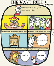
Click on the image for a detailed view!
Happy Birthday to Emdashes!
Benjamin Chambers writes:
Emily says today is Emdashes’ fifth anniversary. In celebration, I offer the following cartoon by Claude Smith, from the June 24, 1967 issue of our favorite magazine. I like to think the group is looking at an early mock-up of this blog. (Click for larger view.)
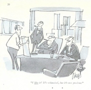
P.S. You can also consider it an entry in Martin’s series of Mad Men Files columns.
The Big Plenty: An End-of-Year Message
_Pollux writes_:
For the economist Paul Krugman, the years 2000 to 2009 may have been “The Big Zero”:http://www.nytimes.com/2009/12/28/opinion/28krugman.html, but for me, thanks to Emdashes, the last couple of years have been an Era of Plenty. I mean the kind of “Plenty” that matters, the kind that is less about material acquisition and more about gaining access to new thoughts and ideas.
To be a part of Emdashes is truly a great privilege and honor, and to work with Emily, Martin, Benjamin, and Jonathan is to be amongst intelligent and congenial company.
2009 marked the first year that I was able to attend The New Yorker Festival, and I hope to attend many more.
2009 was also the year I began writing my “Sempé Fi column”:http://emdashes.com/sempe-fi/, which covers _New Yorker_ covers, and which has been an enjoyable and rewarding experience. And I continue to enjoy drawing “The Wavy Rule.”:http://emdashes.com/the-wavy-rule/
Not only do we celebrate the beginning of a new year and new decade, we also celebrate the anniversary of Emdashes. Five years of Emdashes!
I often wonder how Harold Ross, _The New Yorker’s_ first editor, would have reacted to the existence of our little website. Probably in this manner:

In any case, once blogging, the Internet, and computers had been explained to Mr. Ross, perhaps by either a patient E.B. White, Katherine White, or Rea Irvin, I think the editor would have been tickled pink by our online offering.
Ross would have encouraged us to move forward and do more, more, more. And so we shall. Here’s to a prosperous and productive 2010!
Thank you all! And drive safely tonight! The Internet Superhighway is a dangerous place (“Internet Superhighway” is a term you don’t hear much anymore).

Lorrie Moore’s Latest Novel: Alternate Covers, New Yorker-Style
Emily Gordon writes:
Our friend and Print contributing editor Peter Terzian showcases some of the unused covers for Moore’s novel A Gate at the Stairs (which I reviewed not long ago). And there’s a double New Yorker connection! Peter writes:
Barbara de Wilde, associate art director at Alfred A. Knopf, has designed the jackets of Lorrie Moore’s novels and story collections dating back to Like Life, in 1990. For the cover of A Gate at the Stairs, Moore’s first book in a decade, de Wilde initially contacted Daniel Hertzberg, whose illustrations she had seen in The New Yorker. “I loved the high-contrast quality of his drawings,” she says. “It reminded me of Robert McCloskey books. I wanted all those remarkable colors from Blueberries for Sal and Make Way for Ducklings–those mustards and odd greens and quirky blues.”
Go to the post to see the parallel-universe covers!
The Wavy Rule, a Daily Comic by Pollux: Road Rage
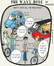
Click on the image for a detailed view!
David Levine, 1926-2009
Martin Schneider writes:
Some people, you figure they will just always be there. David Levine was drawing caricatures for The New York Review of Books well before my birth, and it was only reasonable to suppose he’d be at it years after my death, too. It’s difficult to imagine a world without a steady succession of new Levine drawings in it; it’s not merely perverse fancy to wonder whether Levine’s death makes it impossible for The New York Review of Books to keep publishing articles. That is how strong that association was.
You may have guessed that I grew up in a household with The New York Review of Books in it. Has there ever been a connection between an illustrator and a periodical as strong as that between Levine and The New York Review of Books? Norman Rockwell and The Saturday Evening Post, I guess. I can’t think of another one. His drawings meant as much to the identity of that journal as—if not more than—Rea Irvin’s typeface and monocled fop have meant to the image of The New Yorker.
How do these things happen? It’s not just that the drawings synecdochally came to represent the high quality of the articles in The New York Review of Books; the transferral of associations very nearly worked the other direction, too. I guess it’s just a long-winded way of saying, the artist and the periodical were made for each other.
Maybe the highest compliment one can pay Levine’s work (at least the caricatures; he was also a painter) is that the work lies in some realm beyond which the word “witty” really has no meaning. They were not “witty,” and they were not lacking in wit, either. Many of the drawings contain the kind of visual puns that constitute the most basic elements of the caricaturist’s trade. And the drawings could have dispensed with them altogether, without any loss of quality. The drawings rewarded the intelligent and informed reader who is in a mood to be serious but also engaged. In short, the New York Review of Books kind of reader.
Levine’s art appeared in The New Yorker many, many times, but it would be folly for me to celebrate him as a New Yorker contributor, impressive though those contributions surely were. It would be like celebrating Michael Jordan’s exploits for the Washington Wizards.
Earlier this year, I was obliged to empty out the house in which I grew up. Thirty-five years of living had accumulated in its corners, and I was forced to throw much of it away. During that process I came across a faded sheaf of twelve prints by Levine, presumably distributed to subscribers (in this case, my dad) a decade or three ago. I threw away so much, but I kept this, because reading means something to me, because ideas mean something to me, because The New York Review of Books means something to me, because David Levine means something to me. I’m looking at the prints as I write this.
The Wavy Rule, a Daily Comic by Pollux: Cardinal Numbers

Click on the image for a detailed view!
The Wavy Rule, a Daily Comic by Pollux: The End of Christmas
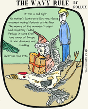
Click on the image for a detailed view!