
_Pollux writes_:
In order to persuade “Saul Steinberg”:http://www.saulsteinbergfoundation.org/ to draw more covers for _The New Yorker_, art editor Françoise Mouly once showed the legendary artist some of the modern covers she had commissioned.
The only ones Steinberg liked were the covers created by Spanish artist “Javier Mariscal.”:http://www.mariscal.com/ “It gave me goosebumps when I heard that,” Mariscal has commented, in this interesting “piece”:http://www.paulgravett.com/index.php/articles/article/javier_mariscal/ by Paul Gravett.
To describe Mariscal as an artist would be an understatement. Mariscal is a one-man industry, a Renaissance Man of the Digital Age who has emerged from the Spanish _posmodernidad_ to produce underground comics, furniture, paintings, sculptures, posters, sketches, murals, typography, product designs, interior decoration, animation, and audio-visual productions. Mariscal is a polymathic Valencian artist who has built a global empire based on whimsy, joyousness, and free-flowing experimentation.
It was Mariscal who designed “Cobi”:http://en.wikipedia.org/wiki/Cobi, the two-legged doodle of a cat-like Catalan sheepdog for the 1992 Summer Olympics in Barcelona (most of Mariscal’s working life has been spent in Barcelona).
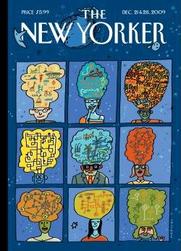
And so Mariscal is the perfect artist to illustrate the cover for the December 21 and 28, 2009 issue of _The New Yorker_. The theme of the issue is “World Changers” and Mariscal is an internationalist artist.
Mariscal’s relationship with _The New Yorker_ is already well-established. Mariscal had contributed to Art Spiegelman’s comics anthology _RAW_ and his previous covers for _The New Yorker_ include, for example, the cover for the August 9, 1993 “issue”:http://archives.newyorker.com/?i=1993-08-09 (*note*: this cover does not appear in the “overhauled”:http://emdashes.com/2009/11/cartoon-bank-overhaul-ben-bass.php Cartoon Bank under the artist’s name or under the date of the issue itself). This 1993 cover depicts a frenetic seaside scene in which a cubist convertible careens along a Mediterranean corniche.
Mariscal’s new cover, called “New Worlds,” is an optimistic depiction of potential “world changers.”
Mariscal was a pioneer of the artistic movement known as Atom Style (also known as _atoomstijl_ or _Style Atome_) that arose in the late 70s and early 80s, which was a throwback to the optimism of the 1950s when it was believed that anything was possible and technology could solve all of mankind’s problems.
In “New Worlds,” ideas burst out of the heads of men and women of all nationalities, ages, and backgrounds. Mariscal creates multi-shaped thought-balloons that fizz with new ideas and innovations. Mariscal’s squiggles, which fill up these multi-colored thought-balloons, create a new symbology that suggest possibilities for innovations in the fields of environmental science, transportation, linguistics, communication, energy, health, and medicine.
We can all be world changers, but no one can do it alone. The 193 nations that attended the United Nations Climate Change Conference in Copenhagen in December 2009 hammered out, with great difficulty, an accord that may lead to positive change. But more conferences, and more cooperation, are needed.
The best ideas emerge from chance, from flights of fancy and castles in the air, and Mariscal, himself an innovator and ideas man, creates doodles that represent the serendipity behind new discoveries.
Mariscal depicts not one struggling single figure in an ivory tower, but multiple figures in closely linked panels set against a universal background. Most of Mariscal’s figures smile. Each of Mariscal’s world changers is a constellation in the galaxy of change, happiness, and hope. Mariscal’s world changers are all “New Worlds.”
Category Archives: Sempé Fi
Sempé Fi: Bows of Holly

_Pollux writes_:
When President Obama bent his body in a 90 degree angle before the Japanese emperor on November 14, 2009, he unleashed, perhaps predictably, a storm of controversy over his bow.
“President Obama has bowed to two Monarchs,” a right-wing commentator angrily “wrote.”:http://politicalpistachio.blogspot.com/2009/11/obamas-bow-to-emperor-akihito-ignorant.html “First, earlier this year, Obama bowed to a Saudi Prince. Last week he bowed to the Japanese Emperor. Note that Akihito did not bow back. The argument by leftists is that Barack Obama was being culturally sensitive. Bowing to Monarchs is a sign of subservience.”
Dick Cheney once shook hands with Akihito, as this _LA Times_ “piece”:http://latimesblogs.latimes.com/washington/2009/11/obama-emperor-akihito-japan.html points out, while Bill Clinton came close to bowing “once.”:http://www.nytimes.com/1994/06/19/weekinreview/the-world-the-president-s-inclination-no-it-wasn-t-a-bow-bow.html “He inclined his head and shoulders forward, he pressed his hands together.” President Nixon performed a slight bow before Emperor Hirohito in 1971.
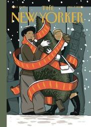
Once “again”:http://www.huffingtonpost.com/2008/07/13/barry-blitt-addresses-his_n_112432.html, Barry Blitt tackles criticism and controversy surrounding Obama by taking the object of criticism (e.g. Obama bowing to a foreign head of state) to its most absurd extreme (e.g. Obama bowing to Santa Claus). Santa Claus, after all, is a foreign potentate of a sort, the leader of an autonomous community in the North Pole inhabited by elves, reindeer, and Mrs. Claus.
Blitt’s cover for the December 14, 2009 issue of _The New Yorker_, called “Season’s Greetings,” depicts Obama bowing and shaking hands with a jolly St. Nick who gingerly steps forward as he emerges from a chimney.
And why shouldn’t Obama welcome Santa Claus? The Christmas figure represents traditions and the joy of the holidays, but also represents the possibility of increased consumer spending during the holiday season. We need to turn this economy around. Santa’s toys and electronics may do the trick.
But of course the source of anger and controversy was the manner in which the Japanese emperor was greeted.
Blitt is currently the most politically minded of _New Yorker_ cover artists. His artistic niche involves poking fun at right-wing fears by exaggerating them. That the Obama Administration has been prone to gaffes and fumbles is undeniable. That Obama’s bow is considered “evidence” of his alleged hate for America is ridiculous.
In any case, both sides may be wrong, as this “piece”:http://blogs.abcnews.com/politicalpunch/2009/11/on-president-obamas-bow-to-the-japanese-emperor-an-academic-friend-writes-that-both-the-left-and-the-right-are-wrong.htmlpoints out, which concludes that Obama’s bow displayed the incorrect “physical tone.”
Blitt’s artistic-political strategy is a little awkward, generating more confusion and misinterpretation than laughter.
A dose of laughter, however, can be supplemented by other sources. The blog Ambiance ran a “caption contest”:http://amba12.wordpress.com/2009/12/13/caption-contest/ for Blitt’s cover. My favorite: “Obamas say they’ll leave milk/cookies out for Santa Claus. Glenn Beck accuses president of trying to bribe a foreign dignitary.”
Sempé Fi: O Christmas Tree
_Pollux writes_:
The genial faces of the December 7, 2009 issue of _The New Yorker_ provide welcome warmth in the coldness of a winter made bleak by war and woes both economic and political. “Holiday Cheers” is the name of the cover, and its artist is the Belgian illustrator “Jan Van Der Veken.”:http://en.wikipedia.org/wiki/Jan_Van_Der_Veken
Van Der Veken’s couple is literally wrapped up in holiday cheer. Unlike the gray passers-by behind them, who are weighed down with packages and briefcases, the young man and woman are fresh-faced, happy, and hopeful. They seem to be joyfully conscious of what the holiday season actually means: togetherness.
In their blissful state, they scarcely notice the layers of snow that have settled on their headwear.
Van Der Veken’s large red ribbon swirls about magically. It gently encircles the happy young couple and the Christmas tree they carry. This is the only purchase they consider important. They don’t care about Black Fridays, Cyber Mondays, or Restock Tuesdays.
Van Der Veken’s retro-modern style lends itself well to this image of optimism and hope. This Belgian illustrator is a practitioner of _atoomstijl_ (“Atomic Style”), a throwback to the _ligne claire_ style first popularized by that other Belgian illustrator, Hergé.
The “Atomic Style” is both retro and futuristic at the same time, evoking a postwar era in which a fascination with nuclear power and rocket science made anything seem possible. The couple is wearing clothes that evoke the 1950s era, a time when men wore fedoras and white gloves and women Chanel suits or Christian Dior jackets.
Pioneered by Yves Chaland, Ted Benoît, Serge Clerc, and Floc’h (who also created a _New Yorker_ “cover”:http://emdashes.com/2009/03/sempe-fi-on-covers-elle.php this year), _atoomstijl_ or _style atome_ sweeps away any hint of cynicism and fatigue that the December 7, 2009 issue may have showcased in the hands of a different illustrator.
Jan Van Der Veken, who signs as “Jan VDV,” is young and energetic. As “this”:http://www.flandershouse.org/jan_van_der_vreken website proclaims, “the positive attitude towards technology and the unlimited possibilities in the future of that era is reflected in all of his works.”
In the short “documentary”:http://www.fabricagrafica.be/content/page.asp?a=SMALLFILMS featured on the website of his design company, Fabrica Grafica, we see him speeding along the streets of Ghent on a Vespa before we cut to footage of the artist in his studio.
Happy Holidays! The world may belong to the young, but a good holiday season belongs to us all.
Sempé Fi: Turkey Run
_Pollux writes_:
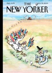
The November 30, 2009 cover of _The New Yorker_ gives us the traditional Thanksgiving images of Pilgrim and Turkey. However, in the hands of an experienced artists like “George Booth”:http://www.bostonphoenix.com/archive/features/99/02/04/GEORGE_BOOTH.html, the relationship between Pilgrim and Turkey is turned upside-down. Booth gives us a “Thanksgiving Skedaddle.”
Booth’s executioner is not the hale and hearty pilgrim he used to be. He cuts a pathetic figure, his shirt flapping in the wind, his belly button exposed. The old pilgrim is skedaddling and skedaddling as fast as he can.
The angry turkey has overpowered him. It displays its colorful feathers in an angry ruffle that dominates the cover. The bird’s cruel talons cut through the November air like corn threshers. They near their target.
It must have been a sudden coup. Perhaps the turkey remained quiet and cooperative until it rested its head on the chopping block, waited until the pilgrim raised his axe, and then -a sudden explosion of anger and rebellion. The pilgrim’s axe still spins in the air.
George Booth creates the illusion of rapid and sudden movement with his combination of narrow, black brushstrokes and wider, colored ones that capture the chaos of angry bird chasing surprised man. Splashes of imperfect spots and lines add to the chaos in this scene. (The word “skedaddle” may in fact derive, according to this “piece”:http://www.worldwidewords.org/weirdwords/ww-ske1.htm by word expert Michael Quinion, from the Scots _skiddle_, meaning to splash water about or spill.)
Instead of a genteel, calm scene of Thanksgiving splendor, Booth gives us humor in a scene in which the Thanksgiving tables are turned. As Emily Coates points out in her “article”:http://www.yaledailynews.com/magazine/magazine-cover/2005/03/04/the-new-kids-at-the-new-yorker/ on _New Yorker_ cartoonists, “chaos typically reigns in a Booth cartoon. Auto body shops, junkyards and shanty interiors establish the ambiance. Cats and dogs hang about. Characters squabble.”
Coates’ article also points out that Booth is part of an older guard of _New Yorker_ cartoonists whose work appears less often in recent years. Nevertheless, Booth’s brush still wields enormous power to amuse and entertain. His work remains funny, effective, and interesting. I give thanks for Booth.
Sempé Fi: Pie and the Sky
_Pollux writes_:
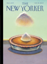
We can’t expect clear skies in late November, but nevertheless we hope to avoid the special kind of rain cloud that hovers over our pumpkin pies. The November 23, 2009 issue of _The New Yorker_, which is “The Food Issue,” features a little cloud hovering above the normally cheery sight of a newly-baked pumpkin pie.
“Wayne Thiebaud’s”:http://en.wikipedia.org/wiki/Wayne_Thiebaud “Pumpkin Cloud” is heavy with rain. Perhaps cheery optimists will hope that the “Pumpkin Cloud” will sprinkle extra whipped cream on the pie, in a sort of Big Rock Candy Mountain kind of fantasy, but I see nothing cheery about the image. Thiebaud’s painting reminds me that we’re never entirely free from worries.
Can we still dig into a pumpkin pie in a carefree manner as we once did? As Phil Gallo “points out”:http://www.zesterdaily.com/media-a-entertainment/281-danger-in-the-kitchen, the November 23 issue of _The New Yorker_ is “likely weighted by the recession — stories about gourmet hamburgers, thousand-dollar meals and Ferran Adria wannabes are certainly gauche these days — but have we reached the point where the joy of eating is gone?”
Depression runs rampant during the holidays. Thiebaud’s cloud is of the emotional kind, a kind of meteorological Sword of Damocles that reminds us that family strife often accompanies Thanksgiving dinners; that political strife still racks the country; that Thanksgiving is followed by the blood-spurting good fun of Black Friday, a frenetic rush for flat-screen TVs and other electronics.
This year, many consumers have foregone the traditional Thanksgiving dinner in order to wait in line outside the department stores and get into the store before anyone else the next morning. And so the pumpkin pie goes cold and uneaten, to be replaced by lifeless electronics and maxed out credit cards.
Thiebaud’s pie is present but where are those who will eat it? Does the pie sit on the edge of a table or of a horizon? This is of course not the first Thiebaud has painted food. Thiebaud gained fame creating still-lifes of all-American foods: pies, cakes, candy, ice creams, hamburgers, hotdogs, and club sandwiches.
Thiebaud’s work “sells well.”:http://oneartworld.com/artists/W/Wayne+Thiebaud.html At his website _Daily Sun Times_, the artist and writer William Theodore Van Doren, who “describes”:http://www.dailysuntimes.net/home/2009/11/22/sunset-sunday-22-november-2009.html Thiebaud’s image as a “luminous and shadowed cream-like cloud hovering over a mound of whipped cream in the middle of a pumpkin pie,” gives a conservative estimate for the value of the original of “Pumpkin Cloud”: $75,000.
Thiebaud’s foods represent nostalgia for a simpler time, when no one worried about calories, cholesterol, and Chinese economic dominance. But what do his paintings mean? What do we make of his rows of gumball machines or lollipops?
I should be careful. As this “article”:http://www.artchive.com/artchive/T/thiebaud.html states:
Thiebaud himself has warned against reading too much into their symbolism. “The symbolic aspect of my work is always confusing to me – it’s never been clear in my mind…. I tend to view the subject matter without trying to be too opaque with respect to its symbolic reference, mostly from the standpoint of problematic attractions – what certain aspects of form offer.”
We should, then, focus on the aspects of form in “Pumpkin Cloud”: the symmetry of cloud and cream, the texture of crust and surface, the horizon and shadow. But that scowl of a cloud isn’t going away.
Sempé Fi: Lumino-city

_Pollux writes_:
“Jorge Colombo’s”:http://www.jorgecolombo.com/ new cover, “Night Lights,” for the November 16, 2009 issue of _The New Yorker_, is as much about negative space as it is about positive space. The blackness and void of nighttime occupies most of the cover; the rest is filled with dots, blots, and rectangles of white and colored light.
Colombo has become a magician with his iPod-created covers. He creates visions of New York City, giving us new versions of it through the filter of his Brushes application. He gives us atmosphere rather than a literal depiction. We already know what the city looks like. Colombo tells us what the city _is_.
His New York is not just a city of light. It is a city entirely composed of light. Amidst the negative space of the night, lights unconnected to one another create a pattern, like a constellation in the night sky. Colombo’s cover is a collection of street lights, stop lights, office lights, building lights, and car lights.
His illuminations vary in size, strength, and color. His lights do not have boundaries; they radiate and emit indistinct glows that seem to pulse like the radii of a giant red star or the corona of the sun. His lights are blurred by nighttime, by weather, by movement, and by distance.
Colombo’s New York City is beautiful, unburdened by the mass and gravity of solid structures. During the night, the city is pure light. And then day comes, and we must face, and see, the solidness of reality.
Sempé Fi: The Fall

_Pollux writes_:
Fall is here, and perhaps it is inevitable that we should get a _New Yorker_ cover that features the image of leaves turning colors and falling on the grounds of Central Park. “Delicious autumn,” the novelist George Eliot once wrote. “My very soul is wedded to it. And if I were a bird I would fly about the Earth seeking the successive autumns.”
But for the November 9, 2009 cover, called “Autumn in Central Park,” we do not get a peaceful, calm scene of yellow, gold, orange, red, and red-orange leaves. The cover artist, “Eric Drooker”:http://www.drooker.com/, gives us a fiery blaze of paint blots that is more dynamic than calming.
The cover is eye-catching, making the _New Yorker_ magazine stand out on a long rack of competing titles.
The color reminds me of a Californian wildfire, the two figures in its center burn victims rather than peaceful pedestrians in Central Park. They’re not in love; they’re not even touching. They walk right into the epicenter of the autumnal conflagration. They are painted in a black smoky color; their long, afternoon shadows look like plumes of smoke.
Drooker creates an image not of touristic leaf peeping but of leaves dominating, encircling, and enveloping an almost antediluvian man and woman, and a fence and lamppost that seem almost flimsy in the face of a fiery fall.
The autumn of course signals change, and change is often violent, and often explosive. Instead of leaves falling gently on the ground, Drooker gives trees exploding with painful transformation. In life, we see change caused by confrontation rather than contemplation.
In any case, leaves do not fall so much as they are ejected by the trees that bear them. As “reported”:http://www.npr.org/templates/story/story.php?storyId=114288700 by NPR not too long ago, trees, triggered by chemical signals, discard the leaves when they become nonfunctional. It’s a “shoving” of the leaves by the tree, not a gentle falling.
And so our souls may be wedded to delicious autumn, but without even knowing it, our souls are wedded to intense change as well.
Sempé Fi: The Masquerade

_Pollux writes_:
Sometimes my approach in writing these Sempé Fi columns involves showing someone, usually not a _New Yorker_ reader, the cover of the latest issue and see what their initial reaction is. With “Chris Ware’s”:http://en.wikipedia.org/wiki/Chris_Ware cover for the November 2, 2009 issue, called “Unmasked,” the reaction I received, from more than one person, was: “Yeah, that’s how people are.”
That’s how people are –meaning the parents who stand in the street depicted in Ware’s cover, their attention monopolized by their phones, rather than in their young children, who are trick-or-treating. The parents are there and not there at the same time, empty uniforms in the field of battle of parenting.
The kids are having their childhood experiences; they probably won’t remember their parents being there at all, if they remember the night at all. The parents aren’t living it. A night out trick-or-treating is a distraction from real life rather than an experience of it. Their phones are keeping them connected to what’s “real.”
The phones cast a glow upon the parents’ faces. Ware skillfully renders the artificial illumination both a masking and an unmasking. The glow turns the faces into masked faces that match the children’s actual masks, but the glow is actually casting a light upon the parents, revealing them to be what they really are: busy, unfocused, unsentimental, and somewhat selfish.
When their kids, whose faces are literally masked and facing the glow of not LCD screens but houses warm with light and candy, get their sack full of Milk Duds and M&M’s, the parents will momentarily put their phones down and move to the next house. It’s an empty ritual; it won’t make for a memorable night, both for child or for parents.
Ware leaves out the usual color and magic associated with Halloween night. Ware creates a bleak image of undecorated houses and parents focused on all the wrong things. It’s a glum procession of the masked and unmasked.
Ware’s cover works as a stand-alone visual piece, but the cover ties in with a graphic short story, also by Ware and also called “Unmasked,” that lies within the covers of _The New Yorker_. Ware manages to incorporate a lot of family drama and commentary on families within the four pages accorded to his illustrated piece.
The first panels of the short story match the image on the cover: a middle-aged woman on her iPhone 3G receiving a text from her husband Phil, who is too busy to accompany her and their four-year-old daughter on Halloween night. He’s too busy. “I was so mad. I could hardly type…” she thinks. “How many Halloweens did he suppose he’d have with his four-year-old?”
But as her young daughter innocently and happily frolics throughout the short story, the woman, too, seems to direct most of her energies and attention elsewhere. As Ware’s story unfolds, we learn that the woman’s mother lives alone since her husband died. The woman and her mother sit in the park, as the four-year-old daughter enjoys herself on a swing. There, at the park, the woman’s mother reveals that her late husband had been having an affair with his teaching assistant.
Her mother’s revelation makes the woman angry rather than sympathetic. Was her mother implying by her revelation that Phil is now cheating on her? She stops drying her daughter with a towel in order to make “a very important phone call to Daddy.”
After she finishes the call, she shrugs off such fears of an affair. “Poor mom…” she thinks, “she was still naïve in so many ways…”
And so the woman assures herself after communicating with her husband via a telephone. Who knows what her husband doing? There’s no way to tell; husband and wife never seem to be in the same room. And her daughter, while still young, will not be young for long, and perhaps will grow up with her own set of resentments and issues.
That’s how people are, and always will be, except now they have access to the fastest, most powerful phones on the market.
Sempé Fi: Pigheaded This Way

_Pollux writes_:
I’m feeling under the weather as I write this, and not because I so intensely dislike “John Cuneo’s”:http://www.johncuneo.com/ cover for the October 26, 2009 that it’s produced a negatively physical reaction in me, but because it’s flu season.
Perhaps it was inevitable that I should come across a virus one of these days. It waited for me in some dark alleyway or on some dirty doorknob. It eagerly waited for me with a set of sickness-carrying brass knuckles, and laid me low.
Cuneo’s subway passengers may also soon fall prey to sickness. They look alarmingly upon a very literal depiction of the swine flu. The porcine predator is putting on a disguise, ready to pucker up and deliver its insalubrious smooch upon unsuspecting victims. She wears old-fashioned clothes, but who can deny her present-day power?
The disguise isn’t a very good one. As the saying goes, you can put lipstick on a pig, but it would still be a pig. This was a “saying”:http://www.time.com/time/nation/article/0,8599,1840392,00.html#ixzz0VwUsQZ4c that of course achieved attention during the 2008 election and is the kind of folksy phrasing that politicians love to throw around and against their opponents.
Here Cuneo uses it as a link between the virus’ name and the fears and confusion surrounding it. No matter how many people shrug off the virus or the associated vaccine as a mere scare or scam, it remains among us. Denial is the lipstick that graces the unlovely lips of a pig.
Cuneo’s cover, called “Flu Season,” captures the fear and confusion that surround this flu season in which we have to contend with the ordinary flu and the swine flu. The H1N1 virus goes forth, claiming new victims, and at the same time a debate rages over whether people should take the vaccine or not.
“I am not going to take it,” Rush Limbaugh said, in an “address “:http://latimesblogs.latimes.com/booster_shots/2009/10/the-folks-who-publicly-said-they-would-rather-see-the-us-go-down-the-toilet-in-the-current-recession-rather-than-see-a-demo.html to Health and Human Services Secretary Kathleen Sebelius, “precisely because you are now telling me I must….I don’t want to take your vaccine. I don’t get flu shots.” Glenn Beck and Bill Maher, on opposite sides of the political spectrum, are also vocal in their skepticism of the vaccine.
As an _LA Times_ piece “commented”:http://latimesblogs.latimes.com/booster_shots/2009/10/the-folks-who-publicly-said-they-would-rather-see-the-us-go-down-the-toilet-in-the-current-recession-rather-than-see-a-demo.html, “this is not a liberal versus conservative issue. This is a science versus nonsense issue.”
Cuneo’s style reminds me of Barry Blitt’s in its mixture of inky lines and intentionally messy pools of paint. Cuneo, rendering the subway car in pen, inkwash, and watercolor, renders the subway car as a long, squiggly, scary hallway evocative of a hospital corridor.
The subway car is nearly empty; the cover’s central focus isn’t so much on the porker smeared with Lipfinity as on the desolate subway itself.
A female commuter steps on the subway car, uncertainly. She still has a chance to escape the virus. In the distance, a lone man quakes as he also looks up from a newspaper.
The pig looks seductively upon a man who reads a paper that announces the arrival of the flu vaccine. The pig has a “Come hither” look that would make the cover not out of place in Cuneo’s “_nEuROTIC_”:http://www.fantagraphics.com/index.php?option=com_virtuemart&page=shop.browse&category_id=417&Itemid=62, a recently published collection of erotic and hilariously perverse drawings.
The cover would be humorous if the prospect of getting sick were not so frightening. As another folksy saying goes, “sickness comes in haste and goes at leisure.”
Sempé Fi: By the Book
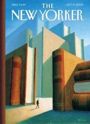
_Pollux writes_:
You call “Eric Drooker”:http://www.drooker.com/ when you need surreal cityscapes depicted at interesting angles. His past work has revealed multiple, parallel New York Cities ranging from neo-Egyptian versions of it to arctic visions of the city.
Now we have his cover for the October 19, 2009 issue of _The New Yorker_, called “In the World of Books.” Drooker has shown us visions of stacked books before, for the November 6, 2006 “cover”:http://www.cartoonbank.com/2006/New-Yorker-Cover-1162006/invt/130216 of _The New Yorker_.
However, while his 2006 cover depicted a man happily reading a book, on this 2009 cover we see a very small figure that is completely dwarfed by a series of book-skyscrapers. No reading is being done. The books look threatening here, not inviting. The books intimidate rather than nourish.
Drooker’s figure walks into a soft pastel glow, perhaps representing the light of knowledge. Are these books that he’s never read but really should? The volume of reading he needs to do is daunting.
I’m reminded by a passage from Italo Calvino’s _If on a winter’s night a traveler_, a book about books: “Eluding these assaults, you come up beneath the towers of the fortress, where other troops are holding out: the Books You’ve Been Planning To Read For Ages, the Books You’ve Been Hunting For Years Without Success, the Books Dealing with Something You’re Working On At The Moment, the Books You Want to Own So They’ll Be Handy Just in case…”
Books are still with us, real books that have yet to be supplanted by upstart e-books and perhaps never will. They remain a dominant part of the culture, and the New York City publishing industry remains a vital part of the cultural landscape.
The October 19, 2009 issue of _The New Yorker_ has within its page articles on books and the publishing world: Rebecca Mead’s piece on Alloy Entertainment (which, according to the company’s “website”:http://www.alloymarketing.com/entertainment/index.html, is “a fully integrated entertainment company that develops and produces original books, television series, and feature films”) and Joan Acocella’s review of Hilary Mantel’s _Wolf Hall_.
The issue also contains Daniel Zalewski’s story on books for obstreperous children and James Wood on Lydia Davis’s short fiction.
Books are still with us. They’re our friends, our allies. But they seem less like friends on Drooker’s cover than sad giants increasingly neglected in a world filled with other distractions and entertainments. They are like Tolkien’s Ents: still very formidable and powerful, but increasingly enshrouded by sadness and oblivion.